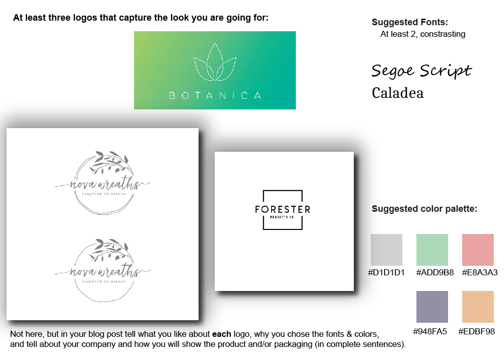
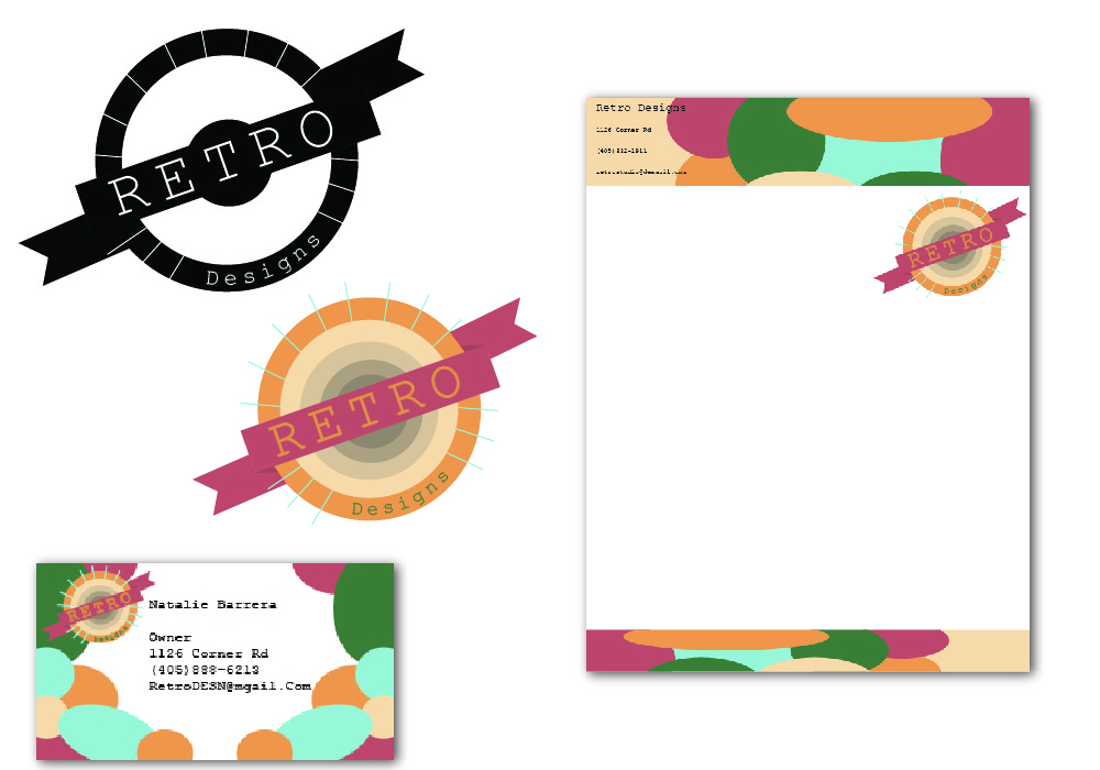
Final Logo

I liked the leaf circle thingy and the font too.

I liked the simple look of the Botanica logo thingy.

I liked the boldish and simple look of the Forester logo and I liked the square around it too.

I chose the colors because I liked the pastel look and I think it’ll look good.

I chose the fonts because it looked the best with what I have in mind.

I will show the product through boxes like the birchbox style.

Mood Board

I liked the type writer look because it reminds you more of vintage stuff and I liked the bold one because you can use that font as anything

Those colors reminded me of the 80s and i wanted bright colors

I liked the flag style of the RETRO logo and the texture. I liked the tree and the birds and mountains on the voyage americas. I liked the sunshine thingy on the green one .

identity marks

Pictorial Logo:

  1. A visual image that represents the client without depicting the client’s
    actual name.

Image result for pictorial logo
https://upengine.io/logo-design

Abstract logo: An abstract mark is a specific type of pictorial logo. Instead of being a recognizable image—like an apple or a bird—it’s an abstract geometric form that represents your business.

Image result for abstract logo
https://www.pinterest.com/pin/504966176942083877/

Wordmark Logo: These logos consist of a typeface which is chosen for its  style   or is manipulated to convey the identity of a business. Even without being styled or manipulated, fonts tend to give off their own impressions. 

Image result for wordmark logo
https://www.google.com/url?sa=i&source=images&cd=&cad=rja&uact=8&ved=2ahUKEwjArYD-_-flAhULbq0KHXWvD-QQjhx6BAgBEAI&url=https%3A%2F%2Fpixellogo.com%2Fblogs%2Fpixellogo-blog-1%2Ftop-10-wordmark-logos-of-all-time&psig=AOvVaw0NNtLrnubn_8vq75_Q-IAF&ust=1573762407611384

Letter mark: Letter mark logos are very similar to wordmark logos in that they are created using typefaces; however, there is a greater focus on just using first letter , initials , or an abbreviation of a company’s name to convey their brand identity.

Image result for lettermark logo
https://www.google.com/url?sa=i&source=images&cd=&cad=rja&uact=8&ved=2ahUKEwigyeSYgOjlAhUJEawKHYQNBUkQjhx6BAgBEAI&url=https%3A%2F%2Fwww.creativebloq.com%2Ffeatures%2Fthe-5-basic-types-of-logo-and-how-to-use-them&psig=AOvVaw1Iuux5s9jqrTHl5ZN5LFFb&ust=1573762466575220

Combination Marks:Logos that integrate both a  symbol       and  text (word marks) are known as combination mark logos. 

Image result for combination mark logo
https://99designs.com/blog/tips/types-of-logos/

Elbems: They are similar to combination marks because they both include a symbol and text; however, unlike combination marks, emblem style logos are more integrated and      enclosed       to appear as one      single       graphic.

Image result for emblem logo
https://www.lionsclubs.org/en/resources-for-members/resource-center/logos-and-emblems

Logo System: A logo system is a graphical framework that  adapts to different situations. By shifting and changing, this framework allows brands to connect with customers by pointing to other ideas and issues.

Image result for logo system
https://blog.mozilla.org/opendesign/evolving-the-firefox-brand/
Design a site like this with WordPress.com
Get started