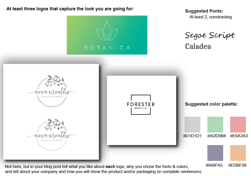
I liked the leaf circle thingy and the font too.
I liked the simple look of the Botanica logo thingy.
I liked the boldish and simple look of the Forester logo and I liked the square around it too.
I chose the colors because I liked the pastel look and I think it’ll look good.
I chose the fonts because it looked the best with what I have in mind.
I will show the product through boxes like the birchbox style.
