
Contrast: Refers to the arrangement of opposite (light vs. dark colors, rough vs. smooth textures, large vs. small shapes, etc.) in a piece so as to create visual interest, excitement and drama. You can make objects or text stand out by using contrast. This can be done through color, size, alignment, etc. (black/white, large/small, thin/wide, etc).
The red boat stands out more against the white boats.
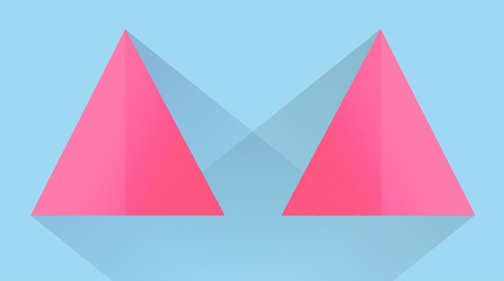
Balance refers to the distribution of visual weight in a design.
It is the arrangement of items on the page so that one side is not weighted heavier than the other.
There are two triangles on each side. Same mass same everything.
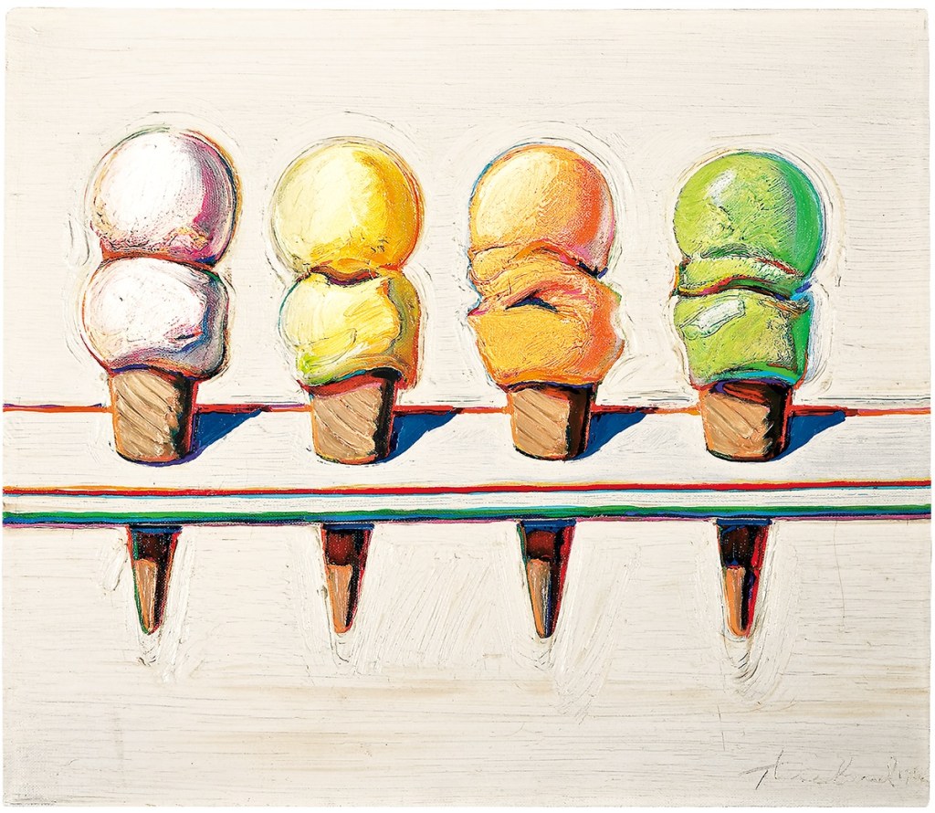
Proximity/unity: The relative closeness or separation between objects that reflects an assumed relationship between those objects is proximity.
There is an even space between each cone.
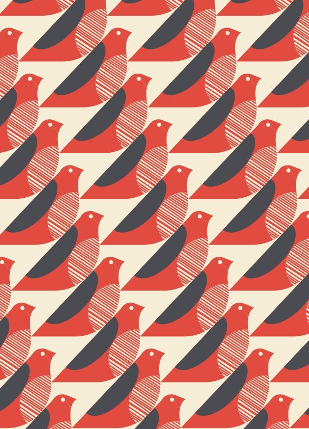
Repetition is simply the process of repeating elements throughout a design
Keeping design uniformity with text, picture elements, and design styles allows the viewer to flow easily through your designs.
There are a repeating line of birds.

In terms of art, white space can be referred to as negative space . It is the portion of a page left unmarked.
There is white space in the background which makes it look like a panda.

Alignment (like the name suggests) is all about organizing elements relative to a line or margin.
On the right, there is perfect spacing and the cubes are in place in a straight line.
